In this class, I have learned fundamental knowledge of interaction and user-centered design from 3 different parts, which are the introduction, task, and site.
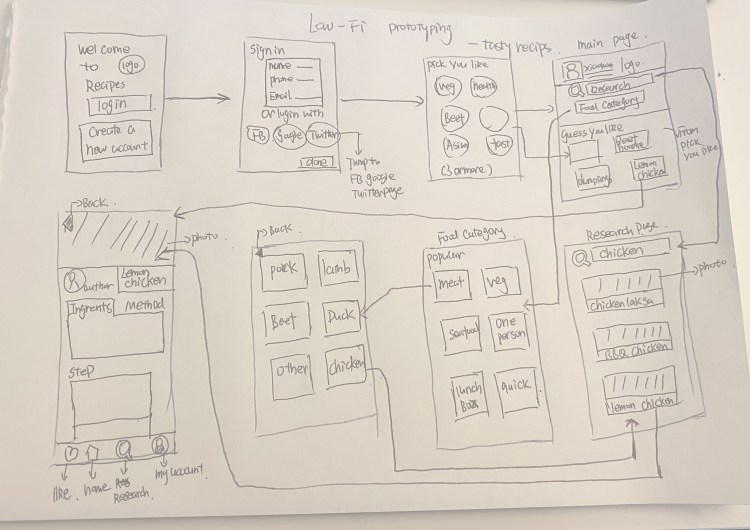
The introduction part helps me get knowledge of what is interaction and user-centered design. The task part is to create prototypes of an app, practice the process of interaction design. The site is the interaction design, and the articles and blogs are my reflection and summary of the whole learning process.
The site
When I started, I wanted to make my blog into a website that introduced me and my work, as a digital design portfolio. It’s not just a diary on class learning. The fact is I’ve been working towards that during this semester. In order to achieve my goal, I made the following changes to my blog.
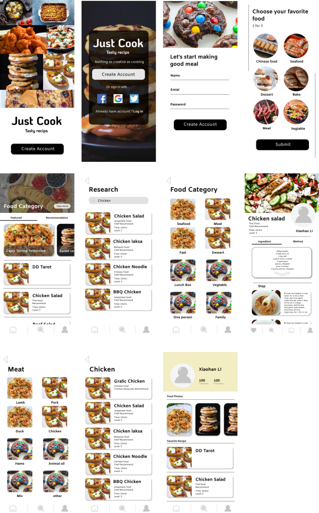
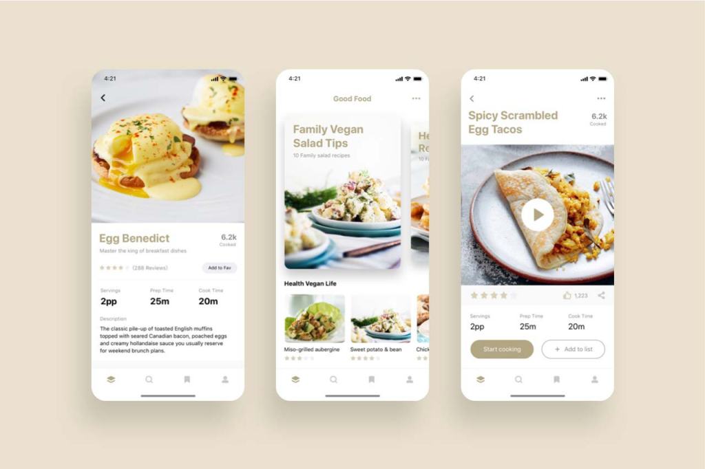
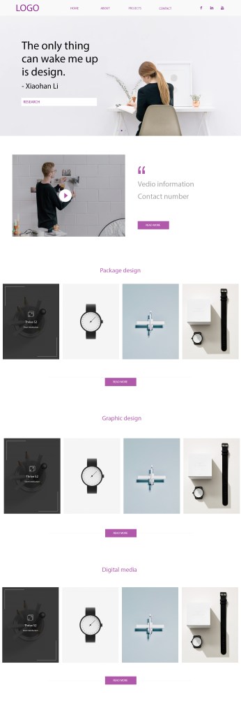
1 For the home page of my blog, I add Homepage, About, CV, Portfolio, and contact button which can link to those pages to know about me, and see my design works.
2 And I also add those function buttons at About, CV, Portfolio, and contact pages.
3 At the bottom of my homepage, I added links to the home pages of my social media site.
4 The recent article is shown below the top part.
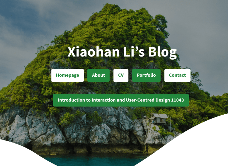
1 Home page 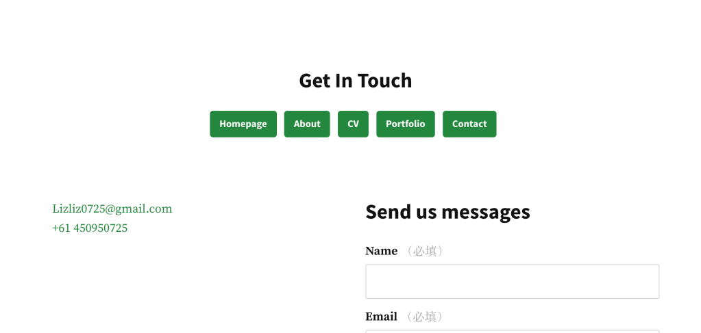
2 Contact page 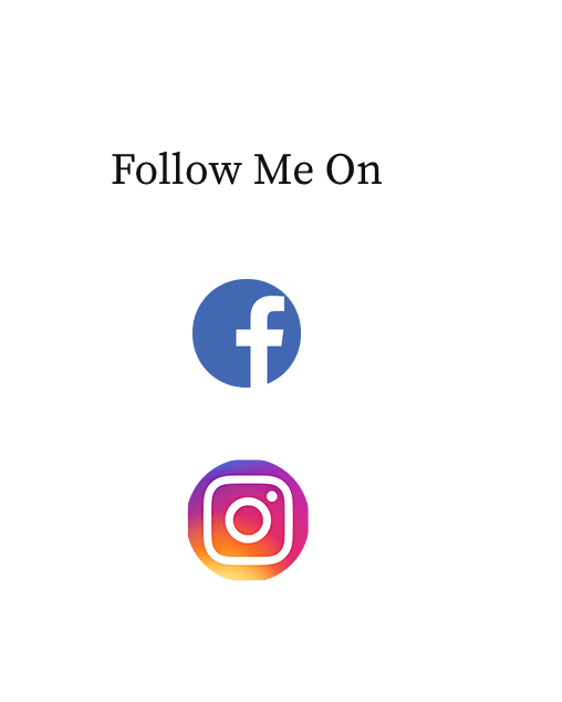
3 The bottom of the home page 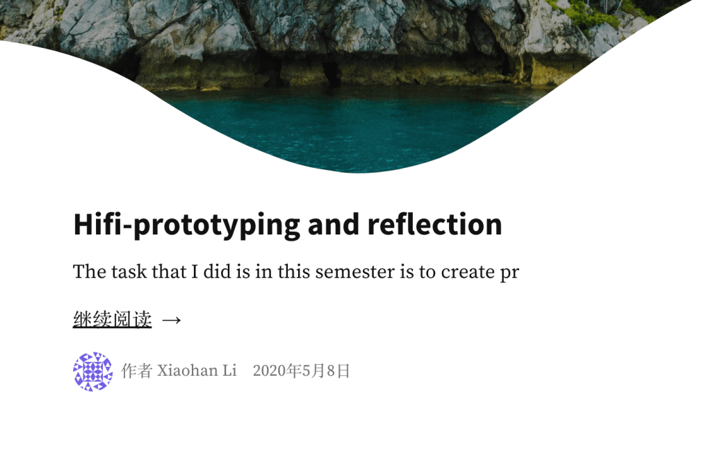
4 Recent article
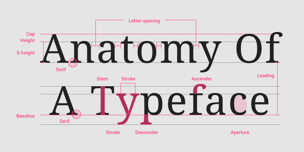
Style and theme
I generally design the layout style as simple and clean as I planned before. I did a sketch for my blog version before, which is different from the layout of the webpage right now. The main reasons are i still can not use WordPress very well and the options in WordPress are limited. For example, I planned to put the About, CV, Portfolio, and contact buttons on the topic of the webpage. But create the navigation bar in WordPress is not suited for the blog page I create. I can put my name or logo on that part only. I need to keep the study of how to use the options well in WordPress.
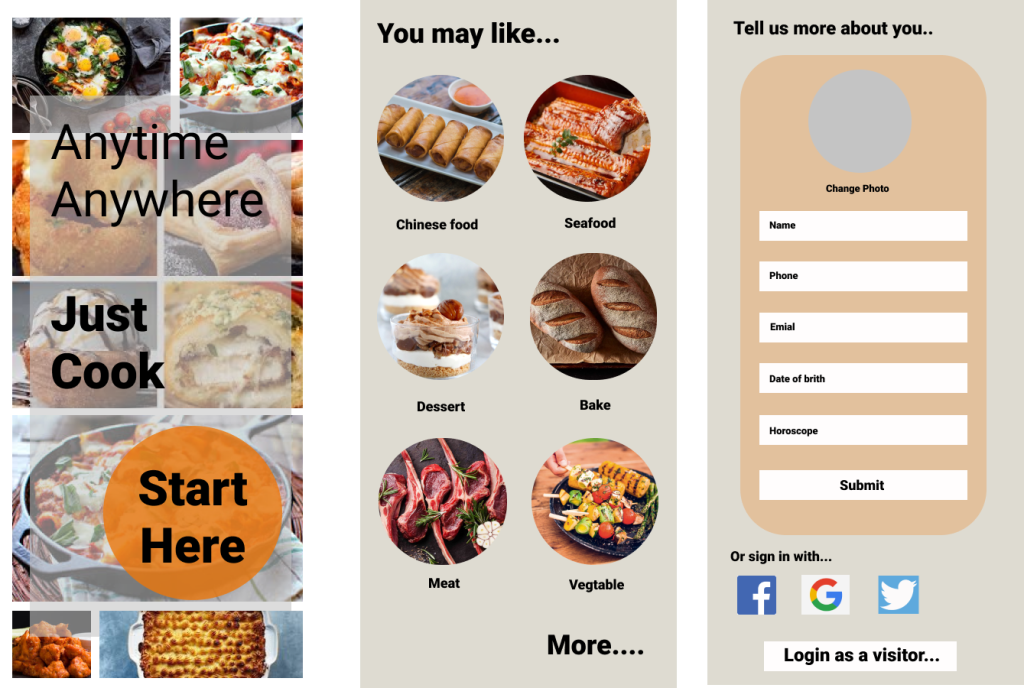
I planned to create a 4-5 section on my blog’s home page. Each section has 4 square buttons – contains a short brief image of each section work. But I find that does not work for the article. There is no way for people to know the content of an article just by looking at a picture. That is the reason why I changed my mind, show the short introduction and the title of articles on the homepage, instead of using an image to represent the title.
Target audience
The target audience I planned they are design students, designers, and HR in design companies. Based on what I did for my blog, I think they roughly match. Design students and designers can find what they want by reading my articles and portfolio page. I think the ‘ HR in design companies ‘ needs to be redefined a little bit. The reason why I set this up as my target audience is that I want to have an opportunity to get a job after they read my blog. But during this semester, especially after I got a job as an intern. I realized that there are not only design companies need designers. Other industries need designers too, For example, marketing companies need designers to design some posters and banners for their brand to support their marketing. As a result, I want to change ‘HR in design companies’ to ‘HR in Companies that need designers’ and change the persona at the same time.
Another thing I changed is I didn’t put my logo on the top. Because I planning to change the target audiences from HR in design companies to HR in Companies that need designers. They might hire me after reading my blog. If I put the logo on my website. It looks like I have been already working for other design company, or I have my own design studio. My logo now is shown on my portfolio page, as one of my design works. That is a good way for my other target audiences, design students, and designers.


 lizliz0725info.data.blog