This week, I’ve learned 2 things that can help me do better in UX design, which is visual style and testing. Firstly, there are 3 mains things are important in UX design visually, grid, typography, and color.
Grid
What is Grid?
In design, the grid is a tool to help us ensure the organizing of the layout. It can help us easier to create a visual style and keep it in a different layout. Grid is widely used in a different area in design, like books, magazines, posters, webpage, and app. For example, when we were designing some app pages, some function buttons need to be placed in the same position on each page. It is hard for designer to placed it in to the right place without any grid.
There are many different types of girds, like Baseline grid, Column grid, Modular grid, Manuscript grid, Pixel grid, and Hierarchical grid.
Reference: Steven, B, 2013,4 Reasons Why You Should Design With A Grid, viewed by 18th April <https://vanseodesign.com/web-design/why-grids/>
Why are grids important in design?
1 Keep the whole page look more Clarity and help users easier to find the right information which they are looking for.
2 Help the designer effectively adds a design element.
3 Using a grid can help designer ensure consistency across all sites
4 Gird make collaborative design becomes easy.
Reference: Andrew, W, 2018, Grids In Graphic Design: A Quick History, and 5 Amazing Tips, viewed by 18th April <https://trydesignlab.com/blog/grids-ui-ux-graphic-design-quick-history-5-amazing-tips/#5>
Typography
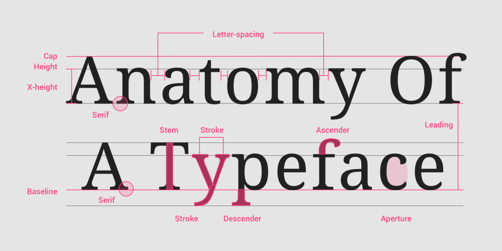
Typography is one of the most important part in UX design, Simply said, typography is craft of arranging text. The aim of typography is to make people feel comfortable and easy to read the words and image.
In UX design, the first things we need to think about the typography is the typeface. The designer should think about what is the end-user and the brand represents when choosing typefaces or fonts at first. After that, try to reflect this in typography.
Reference: Fredrik, F, 2018,It’s just text, how hard could it be? – Typography in UX ,viewed by 18th April <https://www.testbirds.com/blog/its-just-text-how-hard-could-it-be-typography-in-ux/>
Color
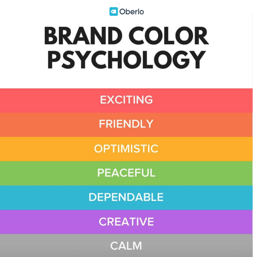
The different color shows different emotion in our daily life. In modern society, different colors give us different signals. For example, red makes people feel enthusiastic.
In UX design, the designer needs to ensure the end-user and brand represents at first. What is the user like? Which colors are suited to this brand represents?
Here is the meanings behind colors which i get from internet to avoid misuse of color.
Reference: Chanka, P, 2018, Color basics and psychology, viewed by 18th April <https://uxdesign.cc/color-effect-b78fae8bb72f>
Testing
Testing in UX design also called usability testing. It is one of the most important part in the UX design.
What is the usability testing?
Usability testing is the process of test your design outcome. The point is to focus on what the user does and not what the user said. It always needs to repeat the test until the design outcomes are not confusing anymore, and the scene meets the designer’s requirements.
Why we need usability testing?
1 Check the design is matching business decisions.
2 Check the design is flowing the user’s experience or not.
3 Get user reactions and feedback
4 Find the problem, delete unnecessary elements.
Tools
There are many design software which can help designer do the usability testing, like Figma and inVision. Build Prototypes with Interactions and Animations is available in both Figma and inVision. For example, the designer can create hotspots for different buttons in one page, and make those connected with other pages.
Reference: Experience ux, n,d, What is usability testing?, viewed by 18th April, <https://www.experienceux.co.uk/faqs/what-is-usability-testing/>
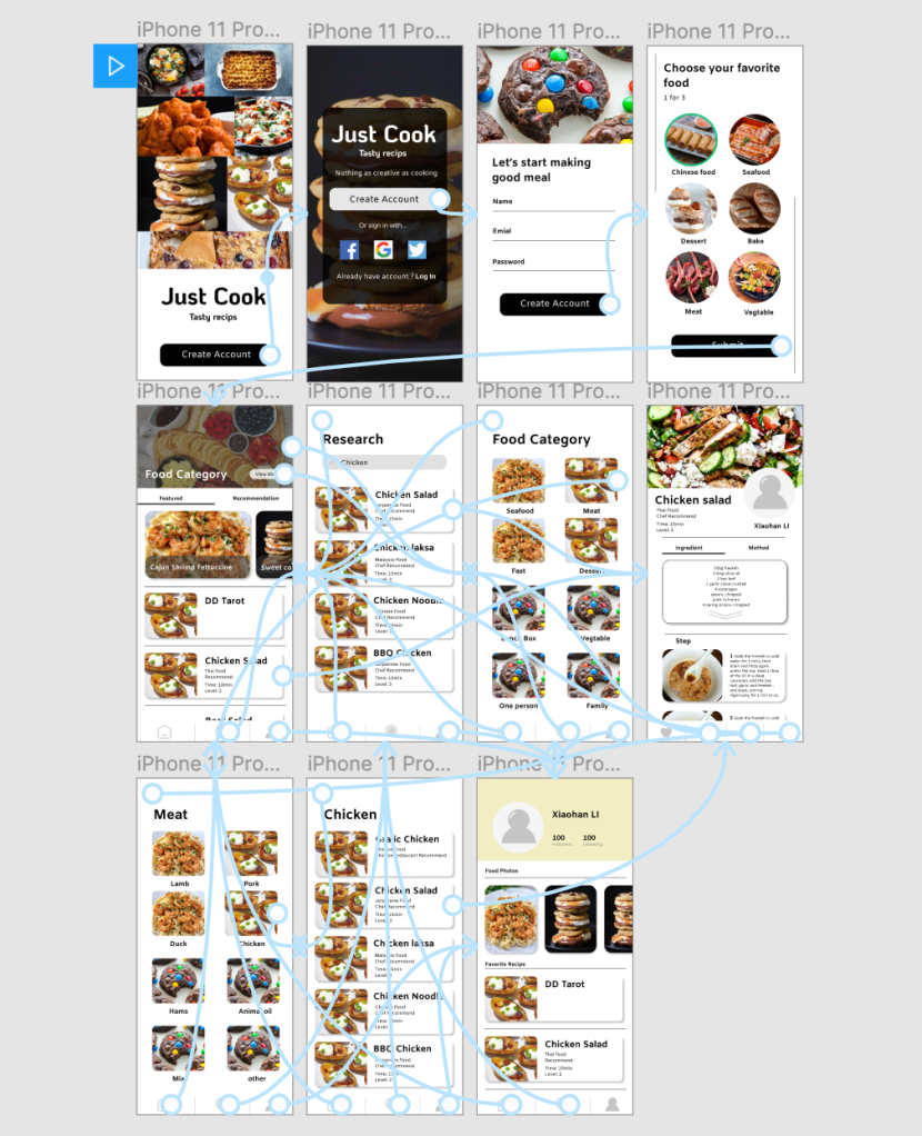
The animation link below:
https://www.figma.com/proto/u2bbHViW5B4DtHxi741F1c/xiaohanLi?node-id=3%3A6&scaling=min-zoom
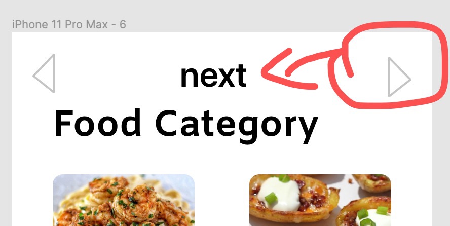
During the process of usability testing, I find the button “Next” is useless. Because we you click the image or words button, it will automatically jump to another page, you don’t need to click the “Next” button. So I deleted all the “Next” buttons.