A design is a plan or specification for the construction of an object or system or for the implementation of an activity or process, or the result of that plan or specification in the form of a prototype, product or process. (Wikipedia, 2019).
In my opinion, the purpose of the design is to make people’s lives more convenient and beautiful. The bad design is not only not beautiful but also make people’s life becomes not aspect.
With this in mind, let’s look at a few bad design examples.
1 Interior design
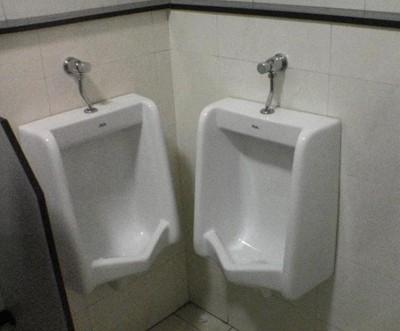
(Ryan Kaverman, 2016)
That’s a bad design. Basically both of these toilets are out of order.
Users:Every male who comes to this toilets
The designer did not consider the user’s habits when he was designing the toilet. Enough space between each toilet should be consider in design process. The bad design is not only inconvenient for users, but also consumes unnecessary human and material costs. It is very important to consider about user’s experience in design.
2 Package design

Like the image said:This sauces look like car cleaning products.
Users: All the customers who come to the this supermarket.
This design doesn’t seem to break any design principles, but it doesn’t consider about Stereotypes in consumer behavior.
What is Stereotypes in consumer behavior?
In my opinion, with the development of society, different kinds of goods always have more or less symbol on the packaging design. That is the part of the original branding. The stereotypes in consumer behavior were coming from it. Like brand design for food always use yellow and red, because these two colors are the main food colors.
As a designer, we need to consider about stereotypes in consumer behavior in each project.
3 Graphic design


Pic 1: In my opinion, In design with words, the first things need to consider is the reader can see the words clearly. This picture looks really harsh. It is hard to read the words.
In graphic design, the designer needs to consider color collocation. It’s important to look comfortable.
Pic 2: Firstly, pic 2 has the same problem with pic 1, rainbow flash color is not a comfortable choice. Secondly, there are so many different fonts that are used in one image.Different fonts make people look uncomfortable. Thirdly, there are too much unnecessary element in one image. It’s hard for people to understand what this image really means.
Welcome you add more example of bad design…
Reference
1 Jenn David Connolly, 2013,Colors That Influence Food Sales, Jenn David Design, viewed by 2nd March <https://jenndavid.com/colors-that-influence-food-sales/>
2 Wikipedia, 2020, Design, viewed by 29th February <https://en.wikipedia.org/wiki/Design>
3 Wikipedia, 2018, Stereotypes in consumer behaviour, viewed by 29th February <https://en.wikipedia.org/wiki/Stereotypes_in_consumer_behaviour>
4 Jarom McDonald, 2016, 11 hilarious examples of bad design, Lucidpress, viewed by 29th February <https://www.lucidpress.com/blog/11-hilarious-examples-of-bad-design>
5 Cryodragon,2015, A look at websites with bad website design , viewed by 29th February <https://cryodragon.ca/2015/11/22/look-websites-bad-web-design/>
